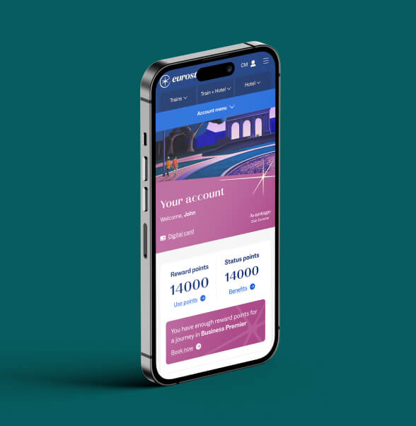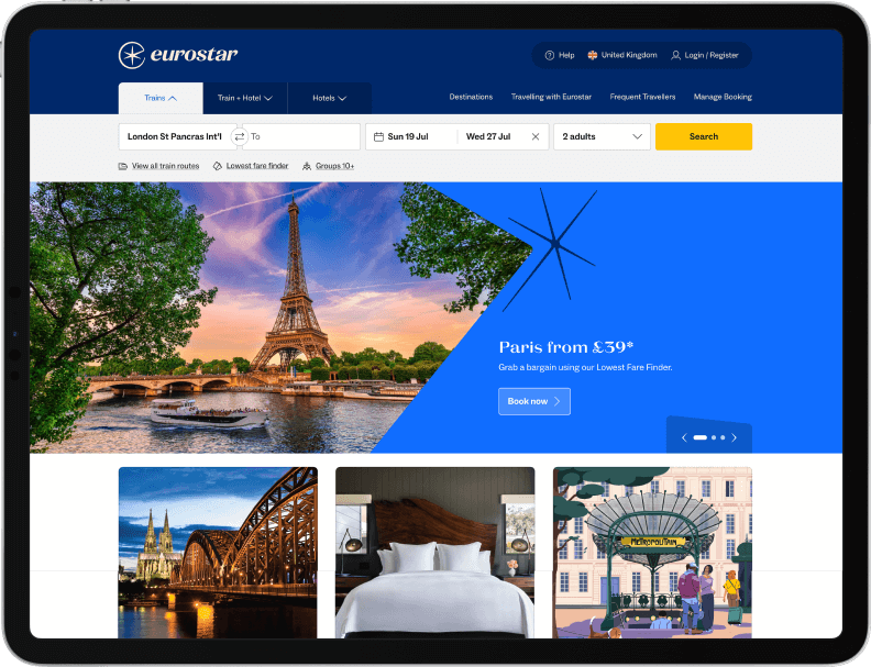

I was responsible for Experience Design for the Club Eurostar, booking management and checkout products, as well as being tasked with optimising UX/UI for the main navigation.
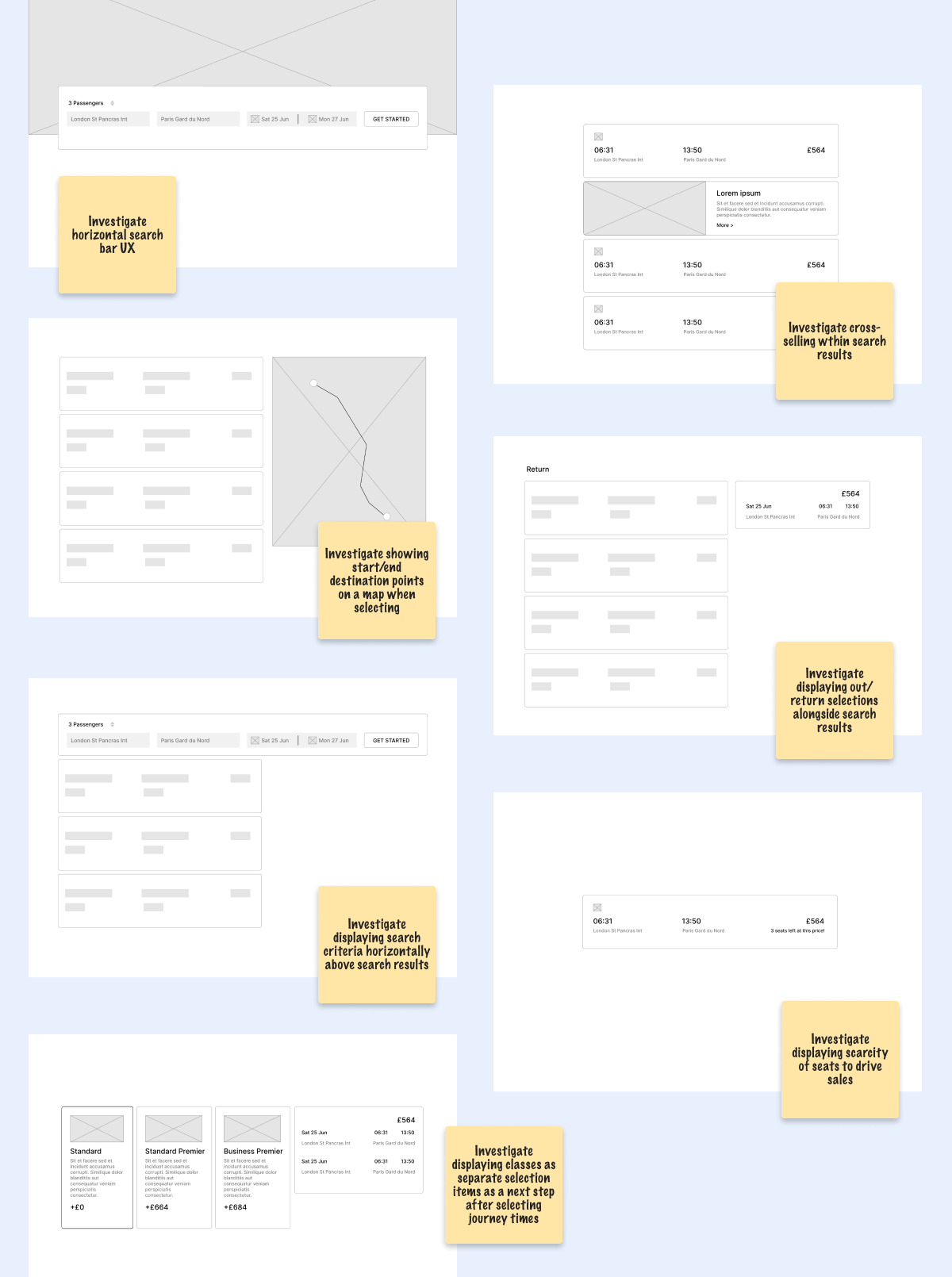
The redesign meant an opportunity to upgrade any existing functionality. My initial deliverable was to provide a set of best practice UX improvements for the booking experience. Using competitor research alongside qualitative design investigation, I provided a set of improvements to take to the next stage of wire-framing and user testing.
Each optimisation was eventually refined and adopted into the final product build.
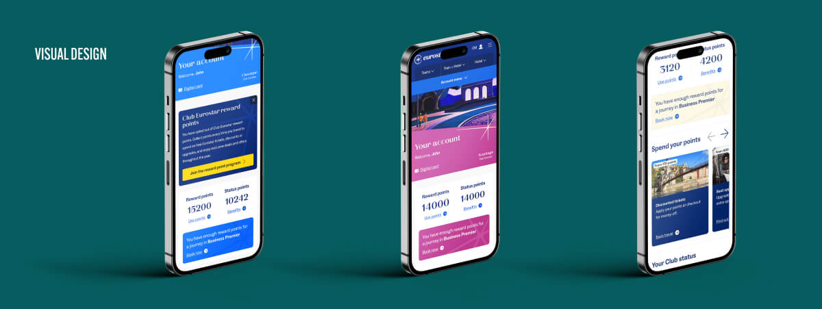
The Club Eurostar experience was completely redesigned from scratch with a new points program while offering similar rewards to the original version. This required solving how to communicate the new mechanics effectively and intuitively without overwhelming any existing or new users.
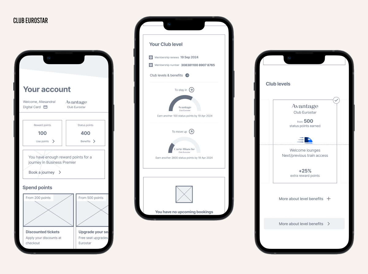
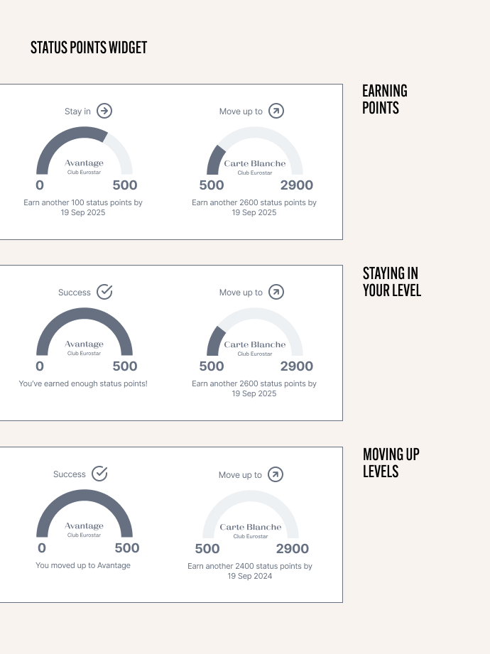
A key part of the offering was the differentiated levels with increasing rewards based on the points earned.
Communicating how and when users moved up or stayed in their level was a challenge.
The solution was to use a set of circular graphs showing points as they were earned.
Proof of concept was tested successfully using a combination of internal employee testing and external unmoderated user tests.
An additional new feature was the introduction of Advance Passenger Information to be collected before passengers travelled. While airlines had already solved this challenge, Eurostar required a nuanced solution allowing users to still collect tickets for passengers who had completed this step, whilst also allowing them to modify their contact details in the same process. There were also nuances between those travelling within European destinations, and those travelling from London.
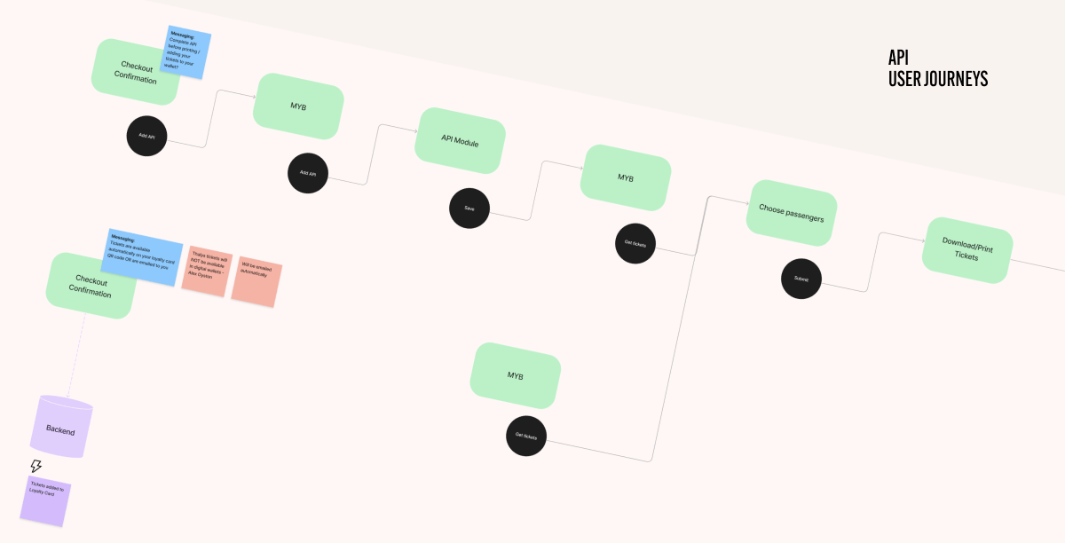
The first step was to identify and map the different user journeys to ensure the information was captured for the right users at the right moment, ensuring physical journeys could be undertaken with minimal friction.
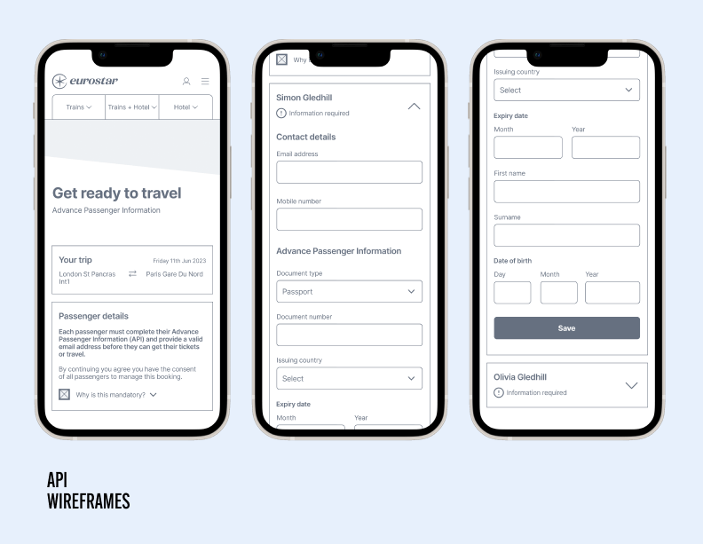
Each journey was wire-framed, mapping the legal information required to the correct type of user.
These were placed into low definition prototypes and run through unmoderated user tests to ensure the process was understandable and to provide feedback for iterations.
With the wireframes defined and tested, the new Eurostar brand was applied and the layouts finalised.
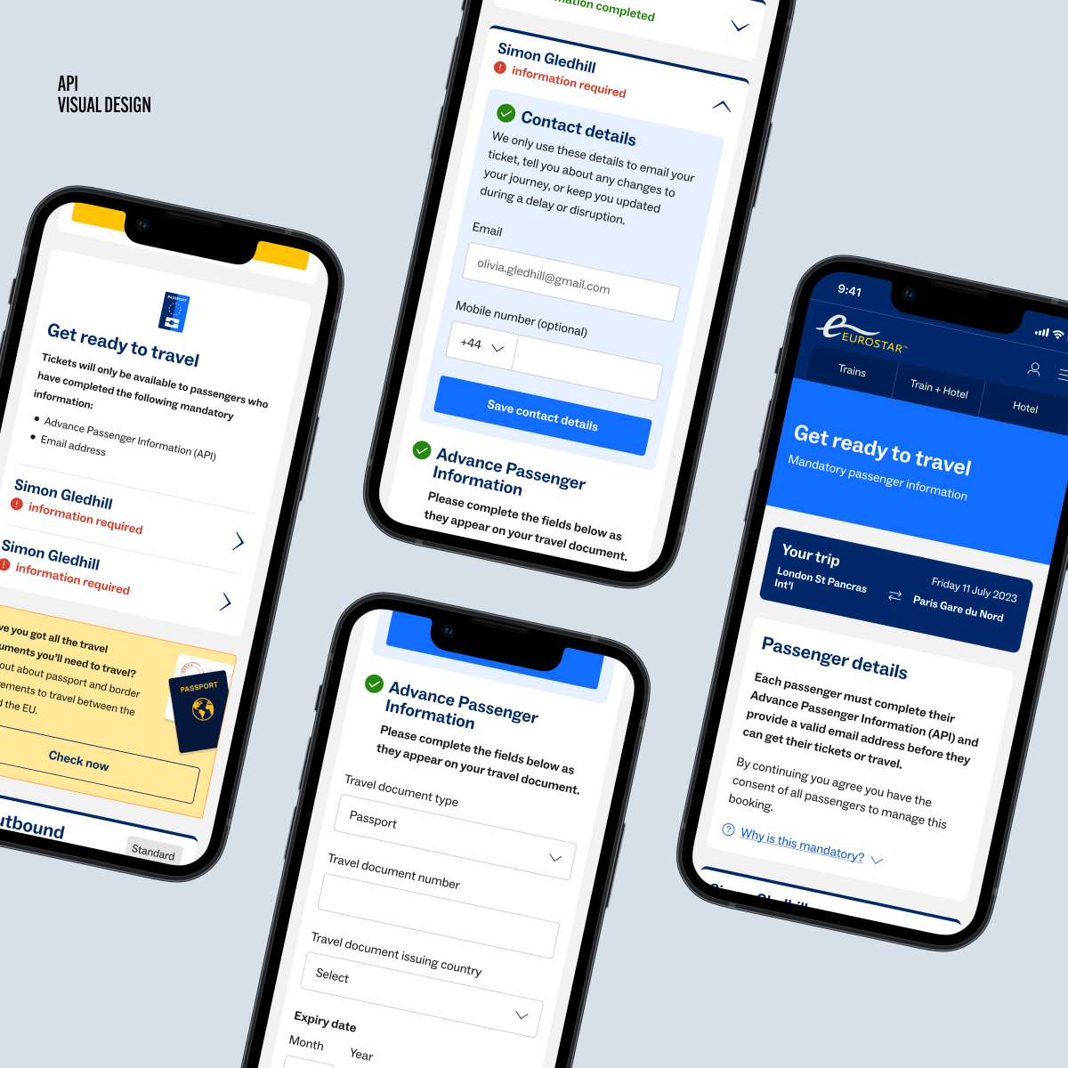
The visual designs were placed into prototypes and again run through unmoderated user tests to provide feedback on any issues and to provide confidence for pushing the design into build.

One area which required improvement was the main navigation menu had been flagged by testers as confusing and awkward to use.
I identified the problems and created a set of new layouts which were placed into high definition prototypes. Using the new Figma variables available I pushed the prototypes in various directions using different timings and mouse events to show and hide the menus.
These were tested using both internal employees feeding back through an anonymous poll, and using external unmoderated testing. The feedback helped to objectively identify and finalise the version which proved the most successful in terms of user experience.
